
The American Tapestry Alliance member discussion list chooses a new topic each month; September’s is the design process. Questions include, “What does your design process look like? Do you spend a lot of time in the design phase? Any tips or tricks that you could share with someone just starting out? What are your favorite tapestry design resources?”
Here are some thoughts as I weave the first of the Valley Grove tapestries. This is a post about process, not the meaning behind the images. (Those will come….) My design process is long, chaotic, non-linear, and not the same from tapestry to tapestry. Nothing is “the right way;” it is what is working for me. I am done designing not when every single decision has been made and the perfect cartoon has been reached, but when I can’t stand waiting to weave for one more minute.
For the Valley Grove tapestries, which will honor the Norwegian immigrant founders of the church and the surrounding region in southern Minnesota, I am using historical Norwegian tapestries as design inspiration. For the first tapestry in the quartet, I used a design found in many historical tapestries, a central image surrounded by a frieze of animals.

My design tools essentials include a pencil, scissors, paper cutter, printer, photographs, Photoshop Elements, and tracing paper.
The central image in my tapestry is not the Virgin Mary and Wise Men, but a majestic oak tree. Read about my sampling and oak tree drawing in an earlier post, “Valley Grove Tapestries: The Great Oak.” I’m weaving the tree now with a white background after discovering through sampling that the lovely blue did not provide enough contrast. Since none of the very light blues I considered fit well in the saturated palette of colors I chose, I waffled between a light gray or white.
The proportions of my border are different than those in the older tapestries. My tapestry is not as large as the older ones, so the border takes up more of the design. I work full-sized when designing, and spent a while cutting bands of construction paper, trying to figure out the right size to fit in the animals. Note the use of another indispensable design tool–tape!

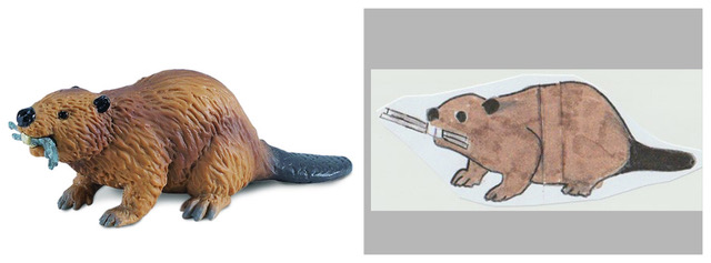
I chose a number of animals that were common to or important to the area and made simplified, weave-able drawings. Sometimes I started with photos of real animals I found online–because how else would I know what a Polish China pig looks like? For the beaver, I started with a photo of a plastic toy beaver. I printed it out, taped it to a window with tracing paper over it, and found the essential lines, the beaver-ness. Sometimes when I finished a drawing it was too big or too small for the border area; that’s easily solved by taking a photo and then using Photoshop to change the size, and printing it out again.
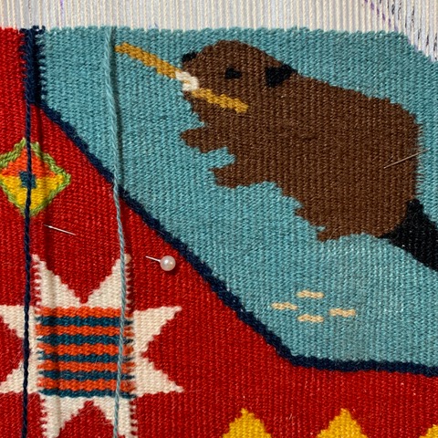
I resized the animals and arranged them until I was happy enough. They needed to be arranged according to color, too—you wouldn’t want all the brown animals on one side, or the black-and-white ones bunched up.

These colors are not true to my chosen colors; I made a smaller black-and-white copy of the border and taped strands of yarn colors to it, to refer to as I weave.
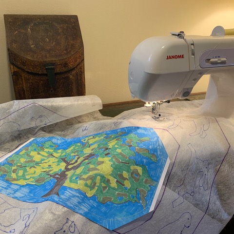
I used non-woven interfacing to trace the outlines onto the cartoon; it’s so easy to see through the interfacing.

To add a bit more weight to the cartoon I added a layer of lightweight iron-on interfacing after tracing the outlines. When I got to the center oak tree image, I didn’t want to outline the small sections again, so I printed another copy and sewed it to the cartoon.
Here we go…almost half-way at the end of September.

Wondrous colors and design!
Thanks so much for the design discussion – the details are so interesting and helpful!