Half of the student projects in my Frida Hansen wool transparent tapestry class were highlighted in this post. Here’s what else was happening around the table.
I was excited that Ivy Riggs decided to weave one of the birds from Frida Hansen’s “Clematis and Birds of Paradise.” Seeing this bird in this transparency at the 2015 Frida Hansen retrospective at the Stavanger Art Museum made me fall in love with the technique.


Now Ivy is weaving her own colorful take on the exotic bird to learn Frida Hansen’s technique. We found it useful to have full-page printouts of details from Frida Hansen’s transparencies near the looms. Individual shots of weaving are clear in the photos, and once you are thinking and observing for a while, her technique becomes more obvious, like how narrow or wider slits of open warp can create marvelous detail. Look at the beautiful blue and purple tail feathers emerging.

Sharon Marquardt continued work on a warp of deep red prydvevgarn at 9 epi that she put on her Mirrix loom before the class. I have had success with, and recommend the heavier aklegarn at 8 epi. Sharon is a very adept weaver, so I was interested to see how she would fare with the thinner yarn. She had two observations to start. The prydvevgarn had problems as warp because the Mirrix shedding mechanism also turned out to be a bit of a shredding mechanism. She switched to picking the pattern threads to avoid friction on the warp. Also, when she tried prydvevgarn, which is a fairly smooth and hard weaving yarn, for weft, she wasn’t getting the coverage she would like with that warp and sett. I mentioned on the first day that I have sometimes used Rauma finullgarn, which is a bit fluffier. Sharon tried that yarn and it covered her warp better.

Sharon was using this pattern, a detail from Frida Hansen’s transparency, Sommernattsdrøm [Summer Night’s Dream].
Jan Mostrom is a friend of mine, and since I talked with her several times while planning the class, she definitely had ideas on the first day. She owns Anniken Thue’s biography of Frida Hansen (out of print, only in Norwegian), and found an interesting border in a photo of one of Frida Hansen’s art tapestries (not a transparency).

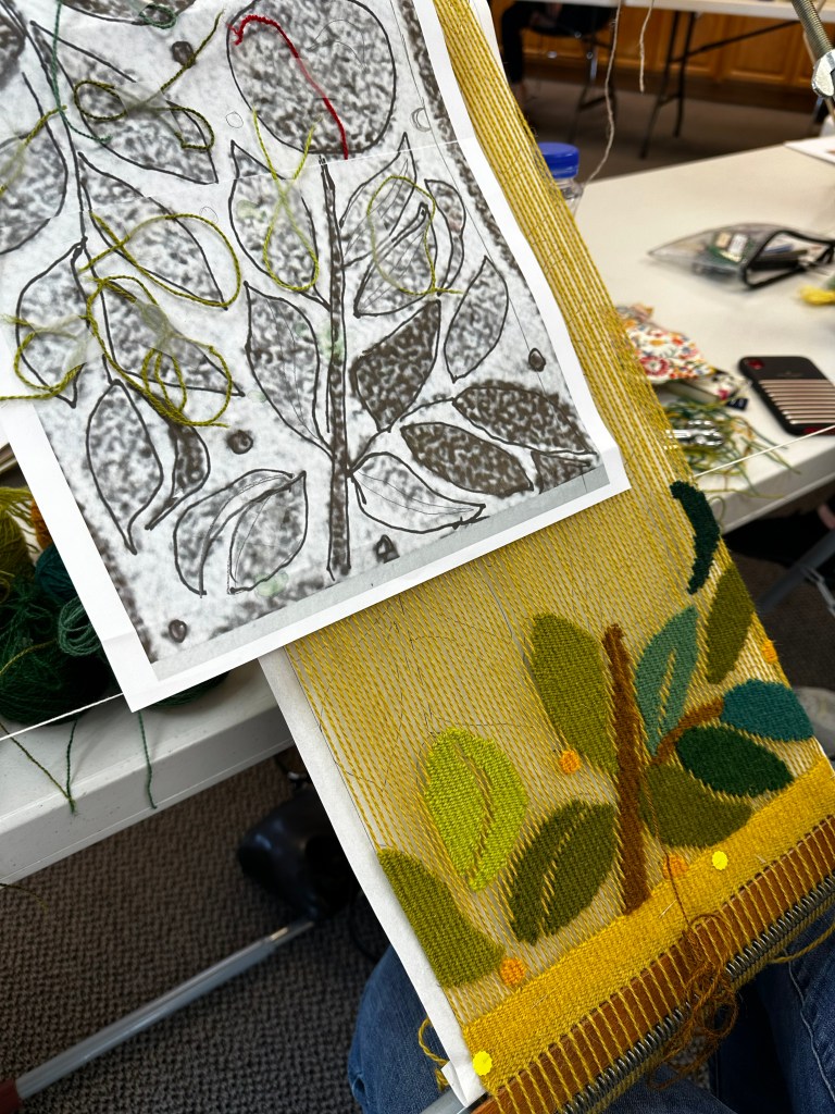
Three apples and many leaves. She expanded the section, traced around the shapes with marker, and then traced with pencil onto tissue. She made adjustments of the orientation of some leaves on the pencil version to avoid long floats. Finally, she traced the shapes onto a stiff interfacing to use as her cartoon. Thicker interfacing works great for a cartoon; it’s easy to pin into, but other students just used paper with no problem. I’ve done both.


One interesting change we made in class was the size of the piece. Jan’s original vertically-oriented pattern was 13″ wide, but we decided that the scale would be fine at 10″ wide. The shapes were still of good size, plus it would not take as long to weave. That’s the beauty of a laptop and printer as design tools — we could print out the design again quite quickly.


Finally, Sheila Oberreuter took her design inspiration from another field, ceramics. She brought a book of ceramic tile patterns, and was eager to try a bee. Frida Hansen often included geometric borders on her transparencies; Sheila added hexagons as a nod to honeycombs. And the bee is sipping from a Frida flower. Her design process included paper, tape, tracing, and a lot of thinking about which parts of the image should be open warp. She chose to keep the bee on top of a leaf, and create its legs with her dark blue open warp.


I am grateful for the chance to see all of these projects develop during my magic week in Decorah. I had so much fun that I agreed to teach the workshop at the Weavers Guild of Minnesota in late February or early March, 2024. Details will be available within a month or so.

